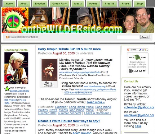
 We re-design our website, of course. You can compare screen shots of the old and new at the bottom of this post.
This re-design has been a long time coming. Kimberly probably would not have talked Ian into spending the day on it it, if it hadn’t been a rainy day. Moreover, a drive out to the North Fork was out of the question since we would just be going into the Hurricane Danny-inspired rain.
 This project has been a long time coming. We bought onthewilderside.com a year ago, but have left the banner up with the .net address until we could do a full re-design. (Full disclosure: We had no choice but to re-do the banner from scratch. The previous header was done two computers ago on Adobe Photoshop. We lost the Pagemaker file with the banner broken into layers. But, we did have the finished jpg. So, Ian grabbed the underlying image for the first panel. We have now switched to the open source GIMP [GNU Image Manipulation Program] program.)
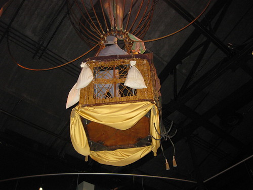
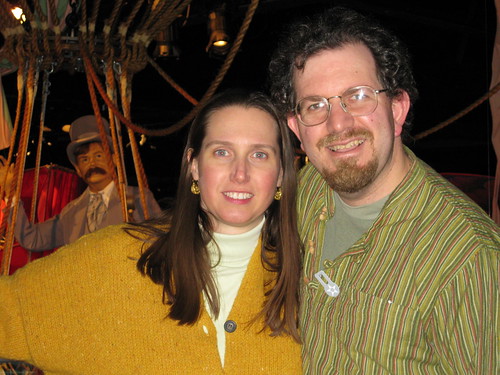 We took the photos for the new header back in January 2009 when we were out with our nephew Josh. In fact, Josh took the photo of us in the last panel. You will notice that we have kept the purple-hatted man in the balloon theme from the previous banner, but expanded it into a full story line. And, with Josh’s help, we brought ourselves into the balloon story.
The original concept was to merge a good new photo of balloon man with a photo of us in the background, but the narrow long shape of the header space (904 x 160) too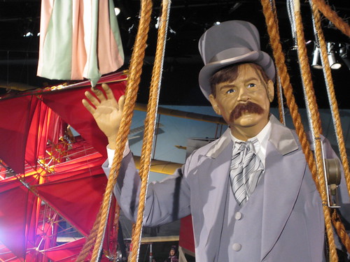 k over, especially when Kimberly also wanted to incorporate the photo of the bottom of the balloon sailing away. If you use a blog that is hosted on WordPress, then you know the header format is limited by the list of pre-set themes among the WordPress theme list. We knew we wanted a theme with a customizable header (e.g. one that allows us to put in our own jpg) and with three columns. The only choice with both attributes was Digg 3 Column. (Though, Kimberly says she saw something on WordPress about a bunch of new themes coming in the near future.) Ian considered the name of the theme to be lucky since we both like the dog on fleas song Dig.
Though, a word of caution when designing for this theme, despite what WordPress says, the size is slightly smaller than 904 x 160. Though we didn’t mind losing a little of the edges of the image, we did have to move the website name up to avoid loosing the bottom of the letters. That, in turn, required us to move up the balloon bottom picture so you could still see the platform underneath.
As we went along in GIMP, Ian saved different version of the xcf file, which is the working file, in case Ctrl-Z didn’t cut it when something went wrong. (We should go back and delete a bunch of those now.) When it started looking like a finished product, we started also saving them as jpg files so we could see what the header would look like. From the two above you can see that at one point we had simple white lettering in Hobo. With that lettering, in order to make it “pop” more, we dropped the transparency on the images to 70% to make them fade into the background. Ian wasn’t happy with the final product. He pasted the text layer in a separate file, and went through looking at the Alpha to Logo filter so he could make the text pop on its own and bring the photos back up. We ended up using the Glossy filter with CD for the text blend and Full Saturation CCW for the outline blend.
We have to give a shout out to wikicommons and the open clip art library for the musical note. They solved our dilemma of representing in the header that we are both a politics and cultural site.
Other changes: Re-organized the pages and tabs. Changed the word “share” to “shop” to make it more obvious that you can find things to buy there. [Note: We have now given up on shopping and affiliate links. We were only selling a couple of things a month, and WordPress doesn’t like in-text advertising, anyway!] Gave some of the pages “section labels” to make them more inviting once you click on. A few weeks ago we had changed the text at the “About” page, to first tell people the kinds of things they can find at our site: Long Island music; festival listings; poetry; third party politics; Green Party politics; ecology, elections information, etc.
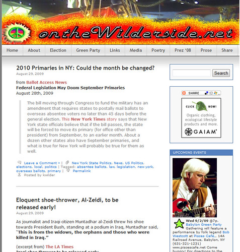
As promised the old and new sites for comparison:
P.S. If you consider an anniversary starting at midnight, then we kicked it all off with an after-the-show diner stop with The Last Internationale . (Videos)
And speaking of dinner, we had a lovely anniversary dinner at Bliss in Setauket. Though not a vegetarian restaurant, they were extremely helpful once alerted of our preference. Before we even sat down, they were willing to go through the menu and explain what could be served vegetarian. And our server even came back out of the kitchen to make sure we understood that a dish we ordered was vegetarian, but not vegan.
Filed under: Art, Food, local, long island, Long Island Music, Long Island Politics, media, music, News, Peace, peace sign, personal, Photos, poetry, politics, Recommended Music, vegetarian Tagged: | banner design, Bliss, blogging, culture, ian wilder, kimberly wilder, music, politics, restaurant, vegetarian


 .
.


Happy Anniversary. I like what you have done with the site.
Thanks, Diane. Great to hear from you. Saw that they posted an Asa Gordon video you recommended over at Green Party Watch. Peace, Kimberly.
[…] may be under the impression that you need to know html or have other technical skills. Twitter – wilderside.wordpress.com 08/31/2009 We re-design our website, of […]
Happy Anniversary Kimberly & Ian!
The new design looks good. You’re inspiring me to check out WordPress.
Only cloud tag looks problematic on a Mac. Not sure why…. A lot of the fonts on the right look a tad too big.
Namaste
Thanks Susan. All those artists, using Macs…what’s that all about?
Thank you both.
Susan, for some reason the automatic style sheet for this theme has a larger font size on the right. I will have to manually change the HTML in the text boxes.
Ian